A fleet dashboard that shows 40 KPIs with equal visual weight is functionally useless. It forces the manager to do the cognitive work of prioritizing — and the result is dashboard fatigue: people stop looking at the reports entirely. The gap between a legacy fleet interface and a modern one is not more data — it is the right data, visible in the right hierarchy, updated in real time, and designed so a fleet manager can go from "log in" to "I know exactly which three vehicles need my attention this morning" in under 10 seconds. Modern fleet management UI/UX is built on a specific set of design principles: tiered KPI hierarchies, role-based views, compact trend indicators, traffic-light status systems, and mobile-first responsiveness. This guide breaks down the dashboard patterns that work in 2026, what each role needs to see first, and how to evaluate whether your current fleet software's interface is helping or hurting your team's speed to decision. Start your free HVI trial and see a modern fleet dashboard live in your browser today, or book a 30-minute demo to walk through the full HVI interface with our team.
The 4 north-star KPIs every modern fleet dashboard leads with
Before anything else, a modern fleet dashboard surfaces four critical KPIs at the top of the screen — the "north stars" that tell a manager within seconds whether the fleet is healthy today. Everything else is a drill-down from these four.
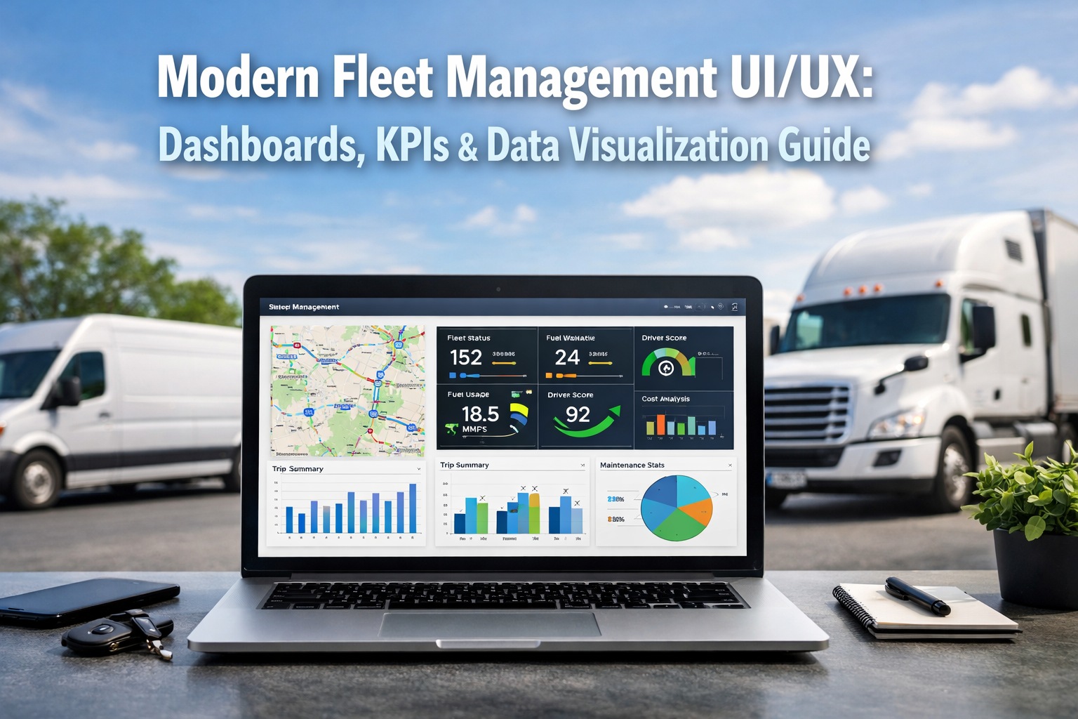
Above: the "KPI hero row" pattern — large-contrast cards with value, comparison delta, and a compact trend sparkline. This is the pattern a fleet manager should see within one second of logging in.
The information hierarchy — what a modern fleet dashboard gets right
Good UI is not about showing everything. It is about showing the right thing first, the next most important thing second, and letting users drill down to detail only when they need it. This three-tier information architecture is the foundation of every modern fleet dashboard.
Visible without scrolling, without clicking, without filters. Answers the single question: "Is my fleet healthy right now?" Should take under 10 seconds to interpret. Large type, high contrast, clear deltas.
One scroll or one click away. Surfaces the "why" behind the glance layer — fuel cost by vehicle, PM compliance by driver, downtime by root cause. These charts let a manager form a hypothesis about what to investigate.
Accessed by clicking into any Tier 2 chart. Individual vehicle history, specific work orders, driver event logs, service records. This is where the investigation ends — full detail available on demand, not cluttering the main view.
Role-based views — one dashboard, three different users
A modern fleet platform doesn't show the same dashboard to everyone. The fleet manager, the dispatcher, and the maintenance tech all need different views — because they act on different signals.
- 4 north-star KPIs with month-over-month delta
- Fleet-wide cost trend (90-day rolling)
- Compliance exposure alerts (MVR, medical certs, DVIRs)
- Top 5 highest-risk vehicles this week
- Budget vs actual maintenance spend
- Live GPS map with all active vehicles
- ETAs and route deviation alerts
- Available vs dispatched vehicle counts
- Driver HOS remaining time
- Real-time breakdown or delay notifications
- Open work orders assigned to me
- Vehicles in my shop today
- AI diagnostic alerts with priority
- Parts availability for today's jobs
- Upcoming PM schedule this week
The 7 visual design principles that separate modern from legacy
Good dashboard design follows consistent rules — not opinions. Here are the seven patterns every modern fleet dashboard applies and every legacy one fails.
Critical numbers sit in large-type, high-contrast cards at the very top of the screen. No user should scroll to find out whether their fleet is healthy.
Green for healthy, amber for warning, red for critical. Applied consistently across every chart, widget, alert, and list — not randomly colored for decoration.
A tiny inline trend chart that shows whether the number is moving in the right direction. Eliminates the need to open a separate report to check trajectory.
Modern dashboards use generous whitespace to group related widgets and separate unrelated ones. Dense, borderless layouts create cognitive overload.
Every alert answers "what should I do?" — not just "here is something unusual." The best designs put the action button directly inside the alert card.
Fleet managers make decisions on phones during yard walks and field visits. A modern dashboard stacks into a mobile column layout without losing any functionality.
Every chart, every KPI, every summary is clickable. Tap a downtime percentage and you land on the list of downtime events. No back-and-forth through menu trees.
The 4 KPI pillars — how to structure your dashboard taxonomy
Modern fleet dashboards organize metrics into four strategic pillars. A balanced dashboard pulls from all four — not 80% cost metrics and nothing on safety or compliance.
Where the budget is bleeding and whether assets are earning their keep.
Whether vehicles are working hard enough to justify their balance-sheet weight.
Protecting people, reputation, and insurance premiums from neglect.
Staying ahead of DOT, FMCSA, CSA, and CVSA inspection exposure.
Legacy fleet UI vs modern fleet UI — the real differences
- Data table-first: Spreadsheet grids with 25+ columns as the home screen
- Equal-weight metrics: Every number shown at same visual size
- Static reports: Export to Excel to actually analyze anything
- No role personalization: Same view for managers, dispatchers, techs
- Decorative color: Random color palettes with no traffic-light logic
- Desktop-only: Mobile is a shrunken desktop, not redesigned
- Menu-tree navigation: 4–5 clicks to reach operational data
- Alerts as email: Critical notifications arrive in inbox, not dashboard
- Hero KPI row: 4 north-star metrics with sparklines at top
- Tiered hierarchy: Glance -> diagnostic -> drill-down
- Live, interactive: Click any chart to drill in instantly
- Role-based views: Manager, dispatcher, tech each see their priority
- Traffic-light system: Consistent red/amber/green across all widgets
- Mobile-first: Works on a phone during yard walks
- One-click drill-down: No menu navigation — tap to investigate
- In-dashboard alerts: Action buttons built into alert cards
Frequently asked questions — fleet dashboard design
Stop tolerating fleet software that was designed for 2010.
Modern fleet UI/UX is measurably faster, clearer, and more actionable than the legacy interfaces most fleets still run on. HVI's dashboard applies every design principle in this guide — hero KPI rows, tiered hierarchy, role-based views, traffic-light color, sparklines, mobile-first layout, and one-click drill-down — out of the box. See for yourself how much faster your team can make decisions when the interface works with them instead of against them.
No credit card required · Full dashboard live in minutes · Role-based views on every plan